
Three cozy color palettes to try on a small scene
Plan a small scene with three original palettes. Give each color a role and compare a swatch before you begin.
By Coco Wyo LLC · Reviewed by Codex (AI), under owner delegation
Published
A small starting point
A palette becomes easier to use when each color has a job. Choose a main color for a large object, a supporting color for a second object, and an accent for one small detail. Leave some paper uncolored if you want a lighter result.
The combinations below are starting points. Their digital colors are planning references, not pencil or marker matches. Your materials, paper and screen can change their appearance. Make three small swatches on a spare piece of the paper you intend to use before coloring the scene.
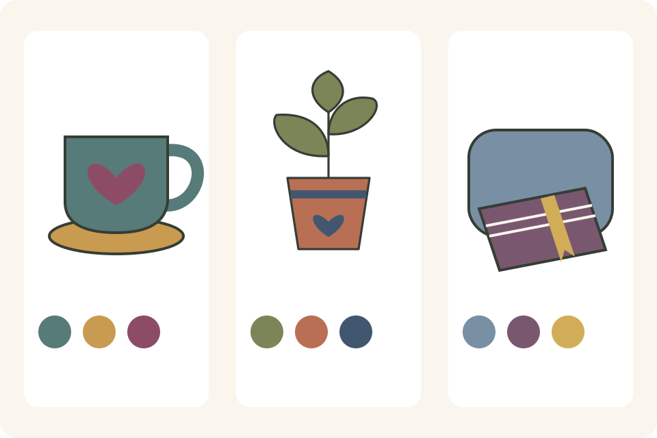
1. Tea by the window
Main: muted teal, digital reference #567B79.
Support: warm ochre, #C99B50.
Accent: berry, #8D4C65.
Try teal on a mug, ochre on its coaster, and berry on a small heart drawn on the mug. Leave the tabletop and background white for this first version. Repeat the berry once in another small detail only if the scene needs it.
2. A quiet plant shelf
Main: soft olive, #7C8558.
Support: terracotta, #B96F54.
Accent: deep blue, #43566F.
Try olive on the leaves, terracotta on the pot, and blue on a narrow stripe around the pot. Keep the shelf uncolored. If two colors look too similar on your paper, change one before filling the larger shapes.
3. Evening reading
Main: dusty blue, #788FA4.
Support: plum, #79586F.
Accent: golden yellow, #D2AD59.
Try blue on a cushion, plum on a closed book cover, and yellow on a bookmark. Keep the accent small at first. You can add more after comparing the whole scene.
Compare one choice at a time
For an illustrated warm-and-cool example, see STAEDTLER's Drawing fox on black and white paper. Its steps combine warm fox colors with cooler shading and green trees. The example uses different materials and paper from your page; it does not demonstrate the three palettes above or establish Coco Wyo paper compatibility.
Draw a simple mug and coaster twice on spare paper. Use the first palette on one copy. On the other, swap the main and supporting colors while keeping the berry heart. Compare which version you prefer: neither is a correct answer.
For a third version, keep your preferred arrangement and change just the accent. Write the actual pencil names or numbers beside your swatches so you can repeat the combination. The aim is a palette you enjoy using, not an exact match to the digital references.
Try your arrangement on a free sample whose shapes suit it, after checking its permitted use. For printing help, read how to print coloring samples. To choose a printed edition, compare the actual previews and printed language in the catalog; a palette does not establish a book's paper compatibility.